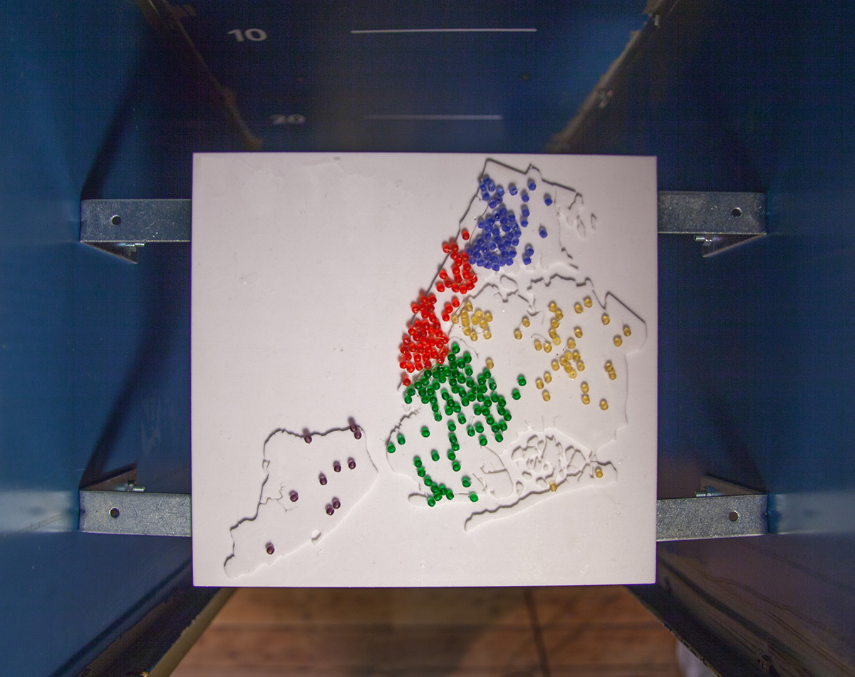
For our final project in Sculpting Data Into Everyday Objects, I worked with Ben Kauffman to visualize the cohort1 dropout rate for high schools in New York City using data from the city’s Department of Education. Each bead on the map represents one high school in New York City, placed in its geographic location. The length of the string represents how many students dropped out from that high school. A bead is glued at each end to hold the string in place and enable it to hang down. If there are multiple high schools at one location, extra beads are added.

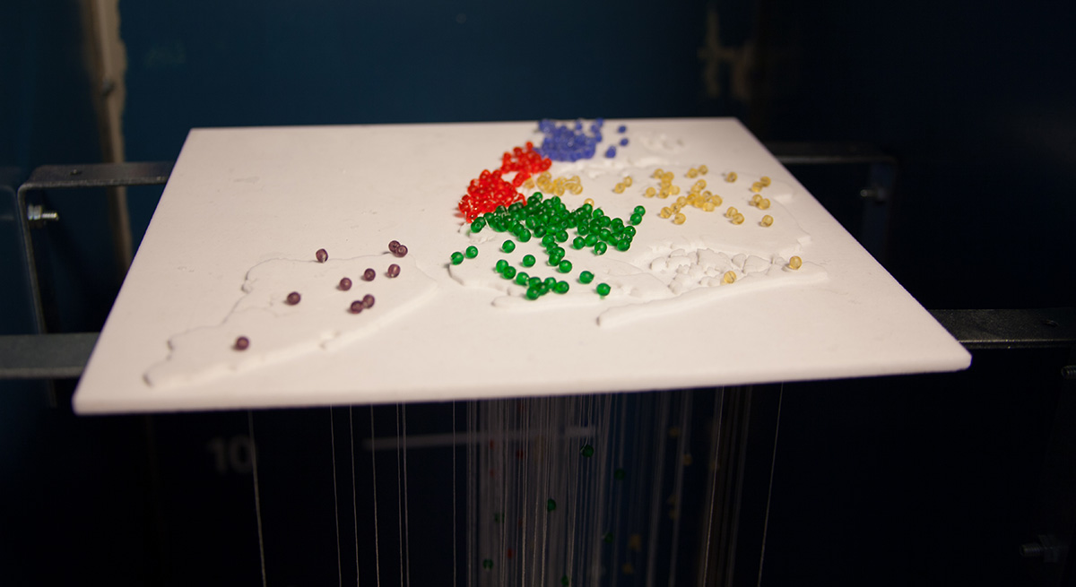

Processing was used to parse and organize the data. Rhino was used to conceptualize the hanging beads and model the shelf from which the strings hang. We printed the shelf using the ZCorp 650 3D printer at NYU’s Advanced Media Studio. The cutting of string and gluing beads was done by hand.
The data was gathered and released by the New York City Department of Education. For every high school in the city, the data tracked members of the class of 2011 starting from their enrollment in 2007. If at the end of the four year period the student has not graduated or is not still enrolled, he or she is considered to have dropped out.
Despite placing schools on the city map, the data tends to resist all-encompassing theories on school attendance. Comparing dropout rates based on borough, neighborhood income level, or race and ethnicity distribution showed no correlations. This may be the result of NYC DOE policy which allows students to attend schools far from their home.
Our findings are granular and raise more questions than they answer. For instance, what explains the disparity between Bushwick Community High School and the Academy of Environmental Leadership, with dropout rates of 41% and 16%, respectively? After all, the two schools are only a few blocks apart. Local and individual analysis of schools, rather than broad patterns, may provide better insight.
1 The University of Minnesota’s National Center on Secondary Education and Transition lists three ways dropout rates can be calculated: the event rate, which measures dropouts in a single year; the status rate, which divides non-enrolled and non-graduated students of a certain age range by all members of that age range; and the cohort rate, which follows a specific group of students over a set period of time. The data represented here is the cohort rate over four years.