Responsive Design and Media Queries
Assignment
You are to design and build an article page for three screens (mobile, tablet, and desktop) using one HTML file and one CSS file.
Take an article from a news site or blog of your choice and reproduce it in HTML. It should include at least eight paragraphs and two images. Don't worry too much about the content; the focus of this exercise is the presentation. Then, using CSS and CSS media queries, create three layouts that change depending on the viewport dimensions. One layout should be optimized for desktop, one for a tablet, and one for mobile. Take advantage of min-width, max-width, and optionally orientation in order to build your media queries.
Due next week.
Responsive Design, as the name suggests, is a way of designing screen-based content in a way that changes depending on the user's viewport. The viewport is the rectangle of a user's screen displaying a given website. For example, a user on a phone can have a portrait viewport (375px by 667px on an iPhone 6, for example), or if they rotate their phone they could also have a landscape viewport. On a desktop device, the viewport is however big the user has made their browser. With responsive design, we understand that our designs will have to work for an almost infinite number of viewport dimensions.
For an example, take a look at the website of the V&A Museum in London. Visit the site on your desktop and on your phone. On your desktop, start resizing your browser and pay attention to how various elements of the page are arranged at various screen sizes.
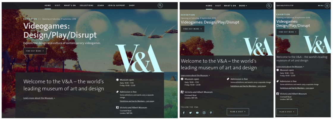
Look at the content area beneath the main logo with a black background. At a wide viewport, it has a maximum width so that it doesn't get too big. It also has a two column layout: the left column has a welcome message, and the right column has information like opening hours and location. Start shrinking your browser and notice how the elements change. At 770px wide, the content shifts into a one-column layout where the welcome message appears above the museum info. At 500px, the font size gets smaller. Or take a look at the header: at around 570px, it changes from having four key links visible to showing the opening hours and an expandable menu. None of these decisions or values are accidental, they are all designed around different devices and different use cases. Why do you think, for example, that the header changes to showing the opening hours at a smaller viewport?
Today, let's look at some of the strategies we can use to implement responsive designs in our code.
Taking Control of Element Widths
Reminder: for all of the examples below, you can see the CSS I've written by checking the element in the web inspector.
By default, a block level element takes up 100% of the viewport's width:
Ut vero qui sit ipsa rem atque quae voluptatum. Perspiciatis saepe perferendis exercitationem aut est voluptatibus dignissimos ea. Consequatur ea aperiam dolores repellat sunt facere. Sed quasi omnis eligendi voluptate non.
Aspernatur rerum illo aliquam sit dignissimos eius autem. Sunt impedit quasi qui veniam et sint ut. Molestiae nihil odit et quod.
Ea harum voluptate voluptatem cumque officia. Minima illo vel sunt harum quia exercitationem impedit voluptates. Iure optio molestias quis est id sed. Asperiores rerum architecto numquam.
The element inherently "responds" to the viewport because it always occupies 100% of its width. We can control this by setting other percentage-based widths. Let's add a column into our example:
This column is floated left with a 70% width.
Ut vero qui sit ipsa rem atque quae voluptatum. Perspiciatis saepe perferendis exercitationem aut est voluptatibus dignissimos ea. Consequatur ea aperiam dolores repellat sunt facere. Sed quasi omnis eligendi voluptate non.
Aspernatur rerum illo aliquam sit dignissimos eius autem. Sunt impedit quasi qui veniam et sint ut. Molestiae nihil odit et quod.
Ea harum voluptate voluptatem cumque officia. Minima illo vel sunt harum quia exercitationem impedit voluptates. Iure optio molestias quis est id sed. Asperiores rerum architecto numquam.
This column is floated right with a 28% width.
Iusto doloremque voluptatibus itaque delectus non. Eveniet deserunt ea voluptate perferendis quis omnis. Dolorum architecto ratione beatae. A amet quaerat quas aspernatur sequi. Maiores ab ad voluptatibus consectetur ea velit veniam praesentium.
While both of these examples might appear fine at smaller screens, they can start to break on larger screens when you might end up with 20 or 30 words on a single line. One way to handle this is by setting a maximum width on an element with the max-width CSS property. For example, I'll put the columns inside a container div and give it a max-width of 800px.
The container has a 800px maximum width and margin: 0 auto. This is a way to horizontally center block level elements with a fixed width.
This column is floated left with a 70% width.
Ut vero qui sit ipsa rem atque quae voluptatum. Perspiciatis saepe perferendis exercitationem aut est voluptatibus dignissimos ea. Consequatur ea aperiam dolores repellat sunt facere. Sed quasi omnis eligendi voluptate non.
Aspernatur rerum illo aliquam sit dignissimos eius autem. Sunt impedit quasi qui veniam et sint ut. Molestiae nihil odit et quod.
Ea harum voluptate voluptatem cumque officia. Minima illo vel sunt harum quia exercitationem impedit voluptates. Iure optio molestias quis est id sed. Asperiores rerum architecto numquam.
This column is floated right with a 28% width.
Iusto doloremque voluptatibus itaque delectus non. Eveniet deserunt ea voluptate perferendis quis omnis. Dolorum architecto ratione beatae. A amet quaerat quas aspernatur sequi. Maiores ab ad voluptatibus consectetur ea velit veniam praesentium.
In the above example, the percentages are still in place, and will kick in when the width of the container falls below its maximum of 800px. Scale the browser width down to see this in effect.
On the V&A's website, try and identify all the containers they've set up and how the columns contained within are floated and assigned percentage-based widths. On a site like that, it's not uncommon to see containers inside of containers inside of containers. This shows us that the designers of the V&A's website have put careful consideration into the hierarchy of their content and how best to divide it into logical, contextually appropriate groups.
Media Queries
The most powerful feature CSS gives us to build responsive pages is the media query. Media queries let us toggle CSS rules given certain conditions about the user's viewport. For example, if a viewport is larger than 1200px wide, make the font size bigger. Or if the viewport has a landscape orientation, maybe the header should move to a left column. Media queries even let us apply certain styles when our website is printed out versus when it's viewed on a screen.
A media query looks like this:
@media screen and (min-width: 400px) {
    body {
        background-color: blue;
    }
}
The first line is where you define your media rules. You can chain them together with and, so you could do something like this:
@media screen and (orientation: landscape) and (min-width: 400px) and (max-width: 1000px) {
    body {
        background-color: blue;
    }
}
What goes inside the @media block is regular CSS selectors, rules, and properties. The difference is that they will only be applied when the media query conditions are satisfied.
Let's see an example. Something you'll see often is a column layout switching to stacked rows at smaller widths - this is because column layouts can look awkward and squished on mobile devices. So in the example below, I've taken our two column example from above and told the columns to stack below 600px.
The container has a 800px maximum width and margin: 0 auto. This is a way to horizontally center block level elements with a fixed width.
With a viewport wider than 600px, this column is floated left with a 70% width. Otherwise, it has no float and a 100% width.
Ut vero qui sit ipsa rem atque quae voluptatum. Perspiciatis saepe perferendis exercitationem aut est voluptatibus dignissimos ea. Consequatur ea aperiam dolores repellat sunt facere. Sed quasi omnis eligendi voluptate non.
Aspernatur rerum illo aliquam sit dignissimos eius autem. Sunt impedit quasi qui veniam et sint ut. Molestiae nihil odit et quod.
Ea harum voluptate voluptatem cumque officia. Minima illo vel sunt harum quia exercitationem impedit voluptates. Iure optio molestias quis est id sed. Asperiores rerum architecto numquam.
With a viewport wider than 600px, this column is floated right with a 28% width. Otherwise, it has no float and a 100% width.
Iusto doloremque voluptatibus itaque delectus non. Eveniet deserunt ea voluptate perferendis quis omnis. Dolorum architecto ratione beatae. A amet quaerat quas aspernatur sequi. Maiores ab ad voluptatibus consectetur ea velit veniam praesentium.
Here's the code that made it work:
.col-left {
    float: left;
    width: 70%;
}

.col-right {
    float: right;
    width: 28%;
}

@media screen and (max-width: 600px) {
    .col-left {
        float: none;
        width: 100%;
    }

    .col-right {
        float: none;
        width: 100%;
    }
}
You don't just have to use media queries for layout. For example, they work very well with typography. Consider the difference between a comfortable, legible text on a desktop screen versus a mobile screen. How could media queries style the same body of text differently for different screen contexts? The mediaqueri.es website is a great gallery of responsive websites showing how everything we've learned so far with HTML and CSS comes together with design.