This week for Data Rep, we had to take a dataset from the Guardian’s Data Blog and represent it in two different ways – one “dry” and one specific to the data it represents. I chose the dataset titled “Pineapple Business Figures.” It contains a list of countries split into two categories: importers and exporters. For each country, the Guardian gives data for total kilograms of pineapples imported or exported, and the price at which they import or export at.
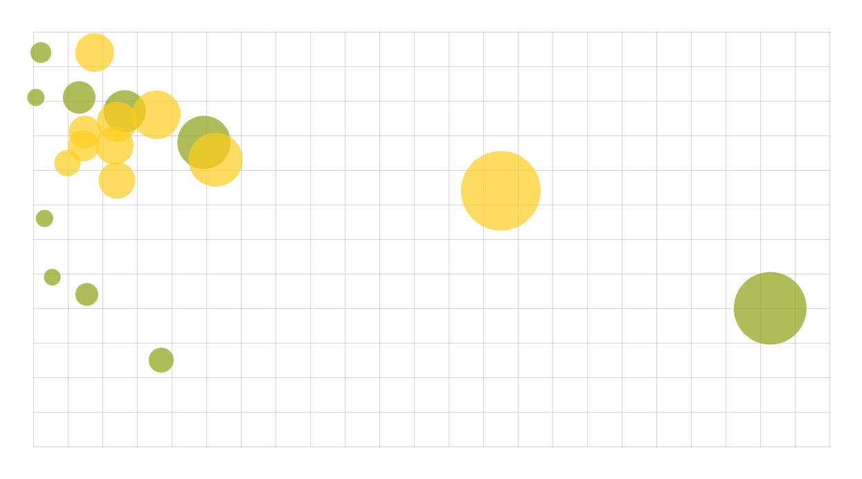
My first visualization plots total weight (x axis) against price per kilo (y axis). The size of the circle represents the total dollar amount. Importers are shown in yellow (the inside of a pineapple) and exporters are shown in green (the outside – cute, right?). The large circle on the far right is Costa Rica (1,112,090,000 kilos exported at $0.40 per kilo). The next one in is the USA (712,950,000 kilos imported at $0.74 per kilo).
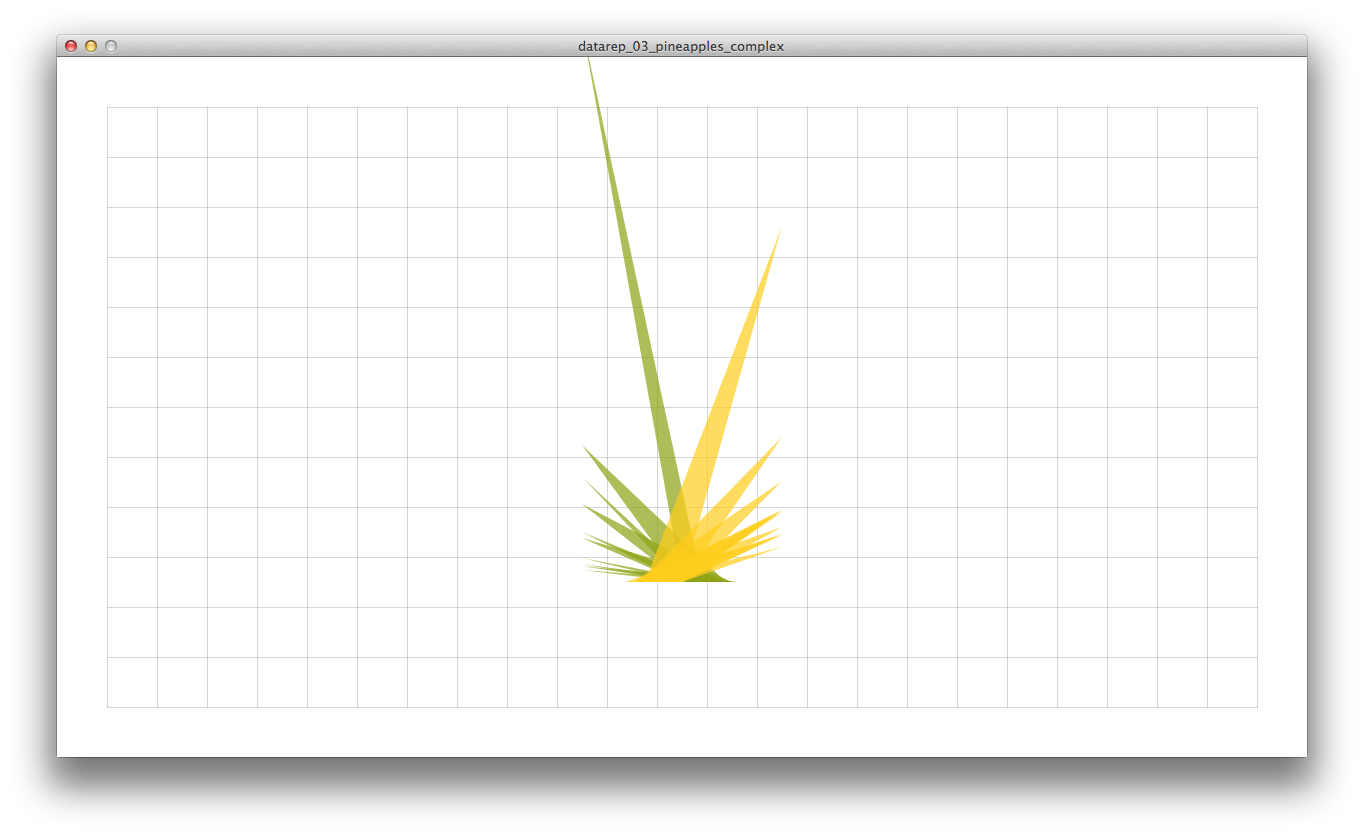
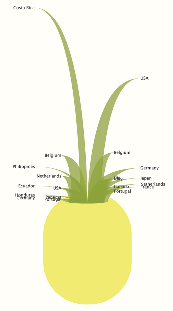
My second visualization is a pineapple that represents pineapples! Exporters are on the left, importers are on the right. The height each shoot correlates to the total weight and the width of each shoot correlates to the price per kilo.
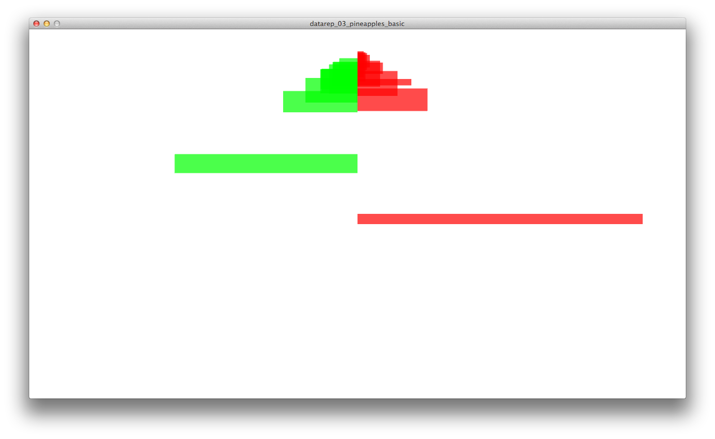
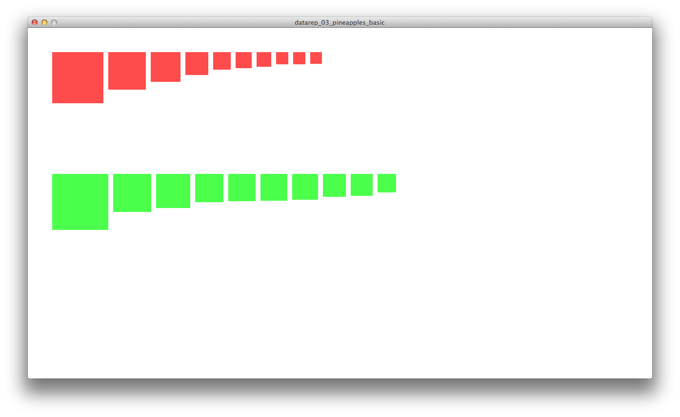
Some progress screenshots: